Input Data Component
The Input Data component allows users to enter or modify data directly within the interface. It is a highly customizable field that supports validation rules, styling, and various data types, enabling user interaction within dashboards or planning models.
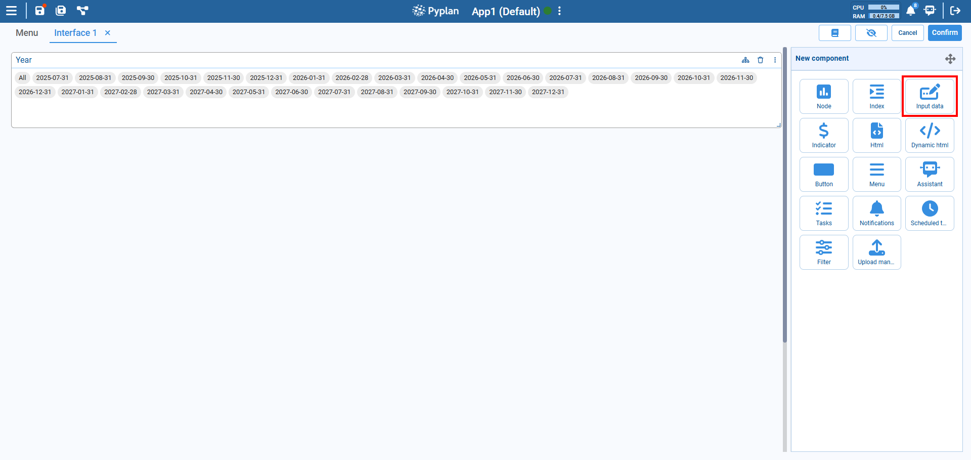
How to Add
- Go to the New component panel.
- Select Input Data.
- A new input box will appear in the interface with default settings.
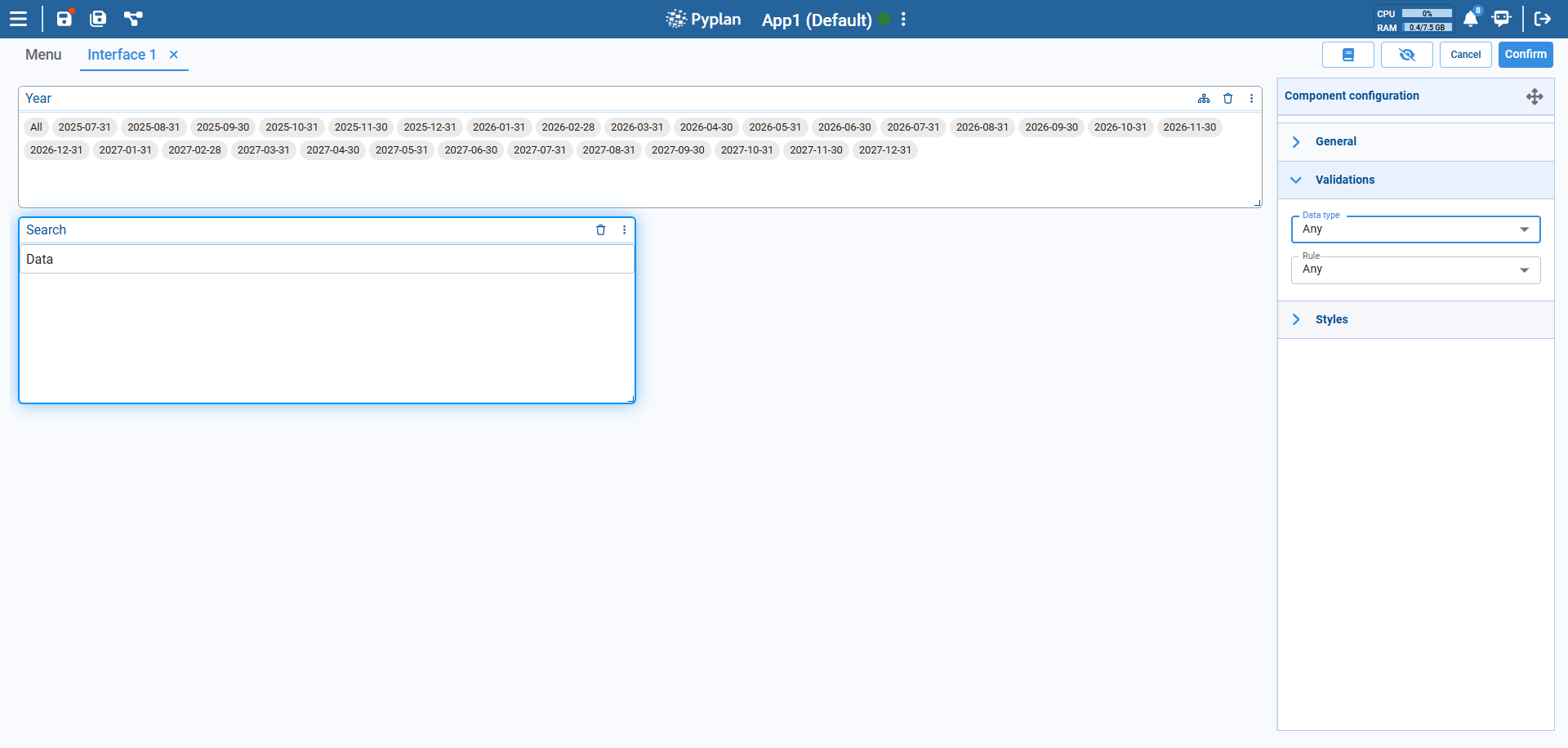
Configuration Options
General
- Title: Sets the component title and supports translations for multiple languages.
- Component: Enables customization of colors and visibility for different parts of the component.
Validations
Data Type
Restricts the type of value the user can input. The available options are:
- Any: Accepts any type of input (no validation).
- Float: Only allows decimal numbers (e.g., 3.14).
- Integer: Only allows whole numbers (e.g., 42).
- String: Only allows text input.
Rule
Applies additional constraints depending on the selected Data type:
For Float and Integer:
Range: Value must be within a specific range (e.g., 0–100).Not in range: Value must be outside a specific range.Equal to: Value must exactly match a given number.Not equal to: Value must differ from a given number.Greater than: Value must be higher than a given number.Less than: Value must be lower than a given number.Greater than or equal to: Value must be equal to or higher than a given number.Less than or equal to: Value must be equal to or lower than a given number.
For String (text input):
Text Length: Restricts the number of characters.
These validations help ensure the user inputs conform to model expectations.
Styles
Located in the Styles section, you can adjust:
- Font size
- Input field alignment
- Background and border colors
- Padding/margin
Tips
- Use validation rules to maintain model integrity.
- Rename the label to make the field purpose clearer (e.g., "Enter Growth %").