Component Styles
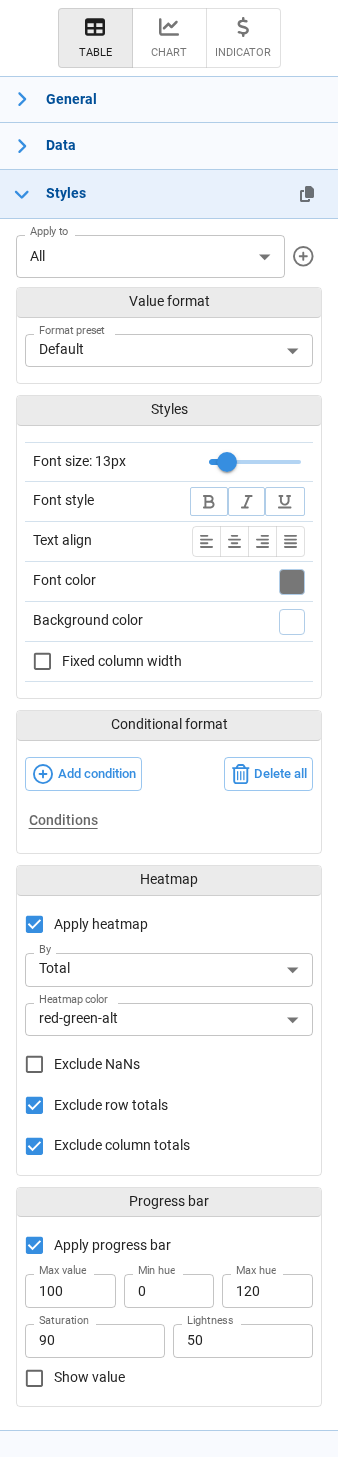
The Styles section appears in the component configuration panel, on the right side of the screen, while we are editing an interface. It controls two related things: how values are formatted (number of decimals, currency symbol, date pattern) and how the component looks (fonts, colors, labels, icons, heatmaps).
Every component has a Styles section, but its content depends on the type of component. There are three different panels:
| Panel | Components |
|---|---|
| Tables, inputs and forms | Table, Input (data array, cube, dataframe), Form |
| Charts | Chart |
| Indicators | Indicator |
The copy and paste icons in the Styles header let us copy the whole style configuration of a component and apply it to another component of the same kind, without repeating the setup. The paste icon only appears once something has been copied.
Tables, inputs and forms
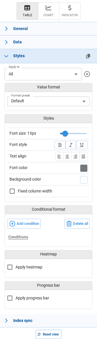
This panel is organized into the following sections. Some of them only appear in certain situations:
| Section | When it appears |
|---|---|
| Apply to | Always |
| Value format | Always |
| Styles | Always |
| Conditional format | Always |
| Cell properties | Only for non-pivot tables |
| Heatmap | Only for Table components. Inputs and Forms do not offer it. |
| Progress bar | Always |
Apply to
At the top of the panel, the Apply to selector decides which cells the settings below will affect.
- All — the settings apply to every cell of the component. This is the baseline style.
- Custom styles — additional styles that apply only to the cells matching a set of conditions (for example, only the Revenue column, or only the rows where the region is North).
Use the + button to create a new custom style. When a custom style is selected, the pencil and trash icons let us edit its conditions or delete it.
Custom styles are evaluated on top of the All style, so we only need to define in them what differs from the baseline.
Style conditions
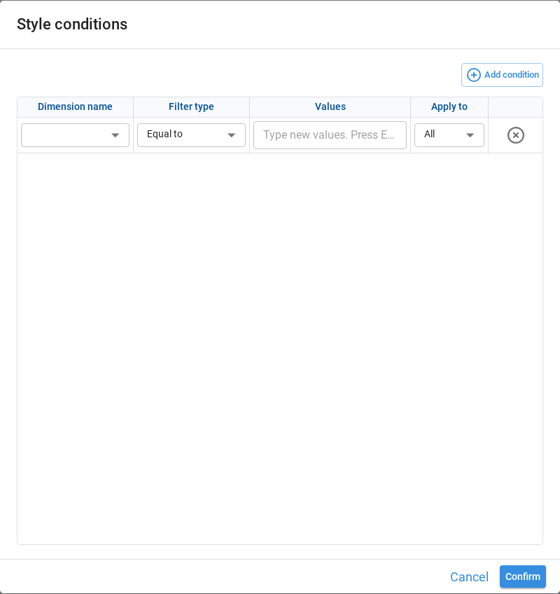
Creating or editing a custom style opens the Style conditions dialog, where we define which cells the style targets. Each row is one condition, and Add condition adds more.
| Field | Description |
|---|---|
| Apply condition to | Whether the condition targets Columns or Rows. This selector is only available for non-pivot tables; in pivot tables conditions always target the index. |
| Dimension name / Column | The dimension or column the condition is evaluated against. |
| Filter type | How the values are matched: Equal to, Not equal to, Contains, Does not contain, Begins with, Does not begin with, Equal to node values, Regular expression. |
| Values | The values to match. With Regular expression, a single pattern is entered instead of a list. |
| Apply to | Which part of the matching cells is styled: All, only the Values, or only the Labels. |
Value format
Controls how the value itself is rendered. Start from a Format preset; the fields below it change depending on the preset chosen.
| Preset | Example | Notes |
|---|---|---|
| Default | — | Inherits the format defined in the application's Default settings. |
| Decimal | 1,000.12 | Thousands separator, 2 decimals. |
| Integer | 1,000 | Thousands separator, no decimals. |
| Currency | $ 1,000.12 | Adds a currency prefix. |
| Currency (rounded) | $ 1,000 | Currency without decimals. |
| Accounting | ($ 1,000.12) | Currency, negative values in parentheses. |
| Accounting (rounded) | ($ 1,000) | Accounting without decimals. |
| Finance | (1,000.12) | Negative values in parentheses, no currency symbol. |
| Finance (rounded) | (1,000) | Finance without decimals. |
| Percent | 10.12% | Renders the value as a percentage. |
| Date | 2022/04/23 | Uses the application's default date pattern unless a custom one is entered. |
| Date time | 2022/04/23 18:05:53 | Uses the application's default datetime pattern unless a custom one is entered. |
| General | 1000.12 | No thousands separator and no fixed number of decimals. |
Changing any field below the preset switches the selector to Custom, keeping the preset it was based on as a reference.
The available fields depend on the type of format:
| Field | Available for | Description |
|---|---|---|
| Thousands separator | Number, Percent | Groups digits in thousands. |
| Show negative numbers in parentheses | Number | Renders negative values as (1,000) instead of -1,000. |
| Decimals | Number, Percent | Number of decimal places, from 0 to 12. |
| Prefix / Suffix | Number | Text added before or after the value, for example a currency symbol or a unit. |
| Date format | Date, Date time | Custom date pattern, for example dd/MM/yyyy. |
This same Value format block is used by every panel, so the presets and fields described here apply to charts and indicators as well.
Styles
Controls the appearance of the cells.
| Option | Description |
|---|---|
| Font size | Font size in pixels, from 9 to 30. Defaults to 13px in tables. |
| Font style | Bold, italic and underline. These can be combined. |
| Text align | Horizontal alignment: left, center, right or justified. |
| Font color | Text color of the cells. |
| Background color | Background color of the cells. |
| Fixed column width | Keeps columns at a fixed width instead of adjusting them to their content. When enabled, a slider sets the width between 50 and 500 pixels. Only available when Apply to is set to All. |
Conditional format
Conditional formats change the appearance of a cell based on its value — for example, showing negative results in red, or adding a warning icon above a threshold.
- Add condition opens the condition editor.
- Existing conditions are listed below, each one with icons to edit or delete it.
- Delete all removes every condition of the currently selected style.
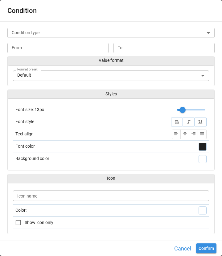
The condition editor has four parts:
Condition type — when the value must match for the format to apply:
| Type | Value to enter |
|---|---|
| Range | A From and a To value. |
| Equal to / Not equal to | A single value. |
| Greater than / Greater than or equal to | A single value. |
| Less than / Less than or equal to | A single value. |
| Expression | An expression where each column name is wrapped in #, for example #Unit price# > 10.5. Every column used must exist in the final table, and the expression must return a boolean series. |
| Function | A Python function that receives the DataFrame and returns a boolean series. |
Expression and Function are only available on custom styles. They are not offered when Apply to is set to All.
Value format — an optional format applied only to the cells matching the condition, using the same options described in Value format.
Styles — the font and colors applied to the matching cells, using the same options described in Styles.
Icon — an optional icon shown in the matching cells:
| Option | Description |
|---|---|
| Icon name | The icon to display, chosen from the icon selector. |
| Color | Color of the icon. |
| Show icon only | Replaces the value with the icon instead of showing both. |
Cell properties
Only available for non-pivot tables.
| Option | Description |
|---|---|
| Read-only | Prevents end users from editing the cells targeted by the current style. Useful to make part of an input table non-editable. |
Heatmap
Only available for Table components. Input tables and Forms do not offer this section.
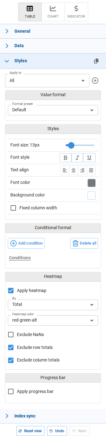
A heatmap colors the cells according to their value, making the distribution visible at a glance.
| Option | Default | Description |
|---|---|---|
| Apply heatmap | Disabled | Enables the heatmap. The options below only appear once it is enabled. |
| By | Total | The scope used to compare values: Total compares against the whole table, Row compares within each row, and Column within each column. |
| Heatmap color | red-green-alt | The color scale. Besides the predefined combinations of red, green, white and blue, Custom lets us pick our own colors. |
| Base background color | — | With Custom, the background color the scale is built from. |
| Text color | — | With Custom, the color of the cell text. |
| Exclude NaNs | Disabled | Leaves cells without a value out of the color scale. |
| Exclude row totals | Enabled | Leaves row totals out of the scale, so they do not distort the color range. |
| Exclude column totals | Enabled | Leaves column totals out of the scale. |
Progress bar
Renders each value as a horizontal bar inside its cell, useful for comparing magnitudes or showing progress towards a target.
| Option | Default | Description |
|---|---|---|
| Apply progress bar | Disabled | Enables the progress bar. The options below only appear once it is enabled. |
| Max value | 100 | The value that corresponds to a full bar. |
| Min hue | 0 | Color of the bar for the lowest values, as an HSL hue. 0 is red. |
| Max hue | 120 | Color of the bar for the highest values, as an HSL hue. 120 is green. |
| Saturation | 90 | Saturation of the bar color, from 0 to 100. |
| Lightness | 50 | Lightness of the bar color, from 0 to 100. |
| Show value | Disabled | Shows the numeric value on top of the bar. |
Charts
Charts have a different Styles panel. There is no Apply to selector and no cell-level formatting: instead, the options describe the chart itself — its labels, its axes and its colors.
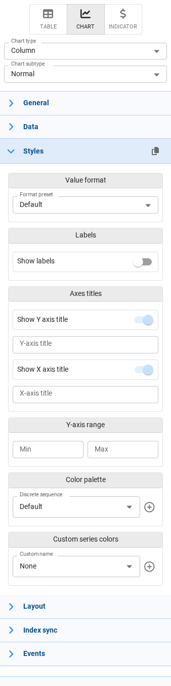
Which sections appear depends on the chart type selected in Chart type, so a given chart will only show the ones that make sense for it:
| Section | When it appears | Options |
|---|---|---|
| Value format | Always | The same presets and fields described in Value format. The Date and Date time presets are not offered, since chart values are numeric. |
| Value format - Secondary axis | Combined charts | Value format for the series plotted against the secondary axis. |
| Labels | Most chart types | Show labels turns the data labels on. Once enabled, Field chooses which value is shown, and for bar and column charts also Position (inside, outside), Minimum size and Mode (none, false, hide, show). |
| Labels - Secondary axis | Combined charts | The same label options for the secondary axis series. |
| Axes titles | Chart types with axes | Show Y axis title and Show X axis title toggles, each with a text field for the title. Leaving the text empty uses the field name. |
| Y-axis range | Bar, column, line, area, scatter and combined charts | Min and Max to fix the scale instead of letting it adjust to the data. In combined charts it also offers Synchronize Y axes scales. |
| Y-axis range - Secondary axis | Combined charts | The range of the secondary axis. |
| Color palette | Charts colored by category | Discrete sequence chooses the palette. The + button creates a custom palette, and the pencil and trash icons edit or delete the selected custom one. |
| Color palette (continuous) | Charts colored by a continuous value | A continuous color scale instead of a discrete sequence. |
| Color palette (waterfall) | Waterfall charts | Separate colors for Increasing, Decreasing and Totals bars. |
| Custom series colors | Charts with series | Assigns a specific color to individual series, so a given series always keeps the same color across charts. |
| Series colors | Combined charts without a color dimension | Colors for the first and second measure of the combined chart. |
Indicators
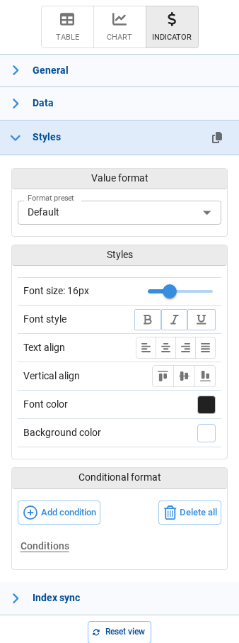
Indicators show a single value, so their Styles panel is the shortest one. There is no Apply to selector, and no Heatmap, Progress bar or Cell properties sections.
| Section | Options |
|---|---|
| Value format | The same presets and fields described in Value format. |
| Styles | The same options described in Styles, plus Vertical align to position the value inside the component. The default font size here is 16px. |
| Conditional format | The same editor described in Conditional format, used to change the look of the indicator based on its value — for example red when the value is negative. Since indicators have no custom styles, the Expression and Function condition types are not available. |
Relationship with the application defaults
Many of these settings can also be defined once for the whole application, in the Default settings tab of the App properties dialog.
The application defaults act as a baseline, and they only apply to components that do not define their own value. Whenever a component sets a property here, that value prevails over the application default.