Menu Component
The Menu component is used to build navigation menus inside a Pyplan interface. With it you can group links to different interfaces or actions in a single, structured component, making it easier for users to move through the application.
Adding and Configuring a Menu
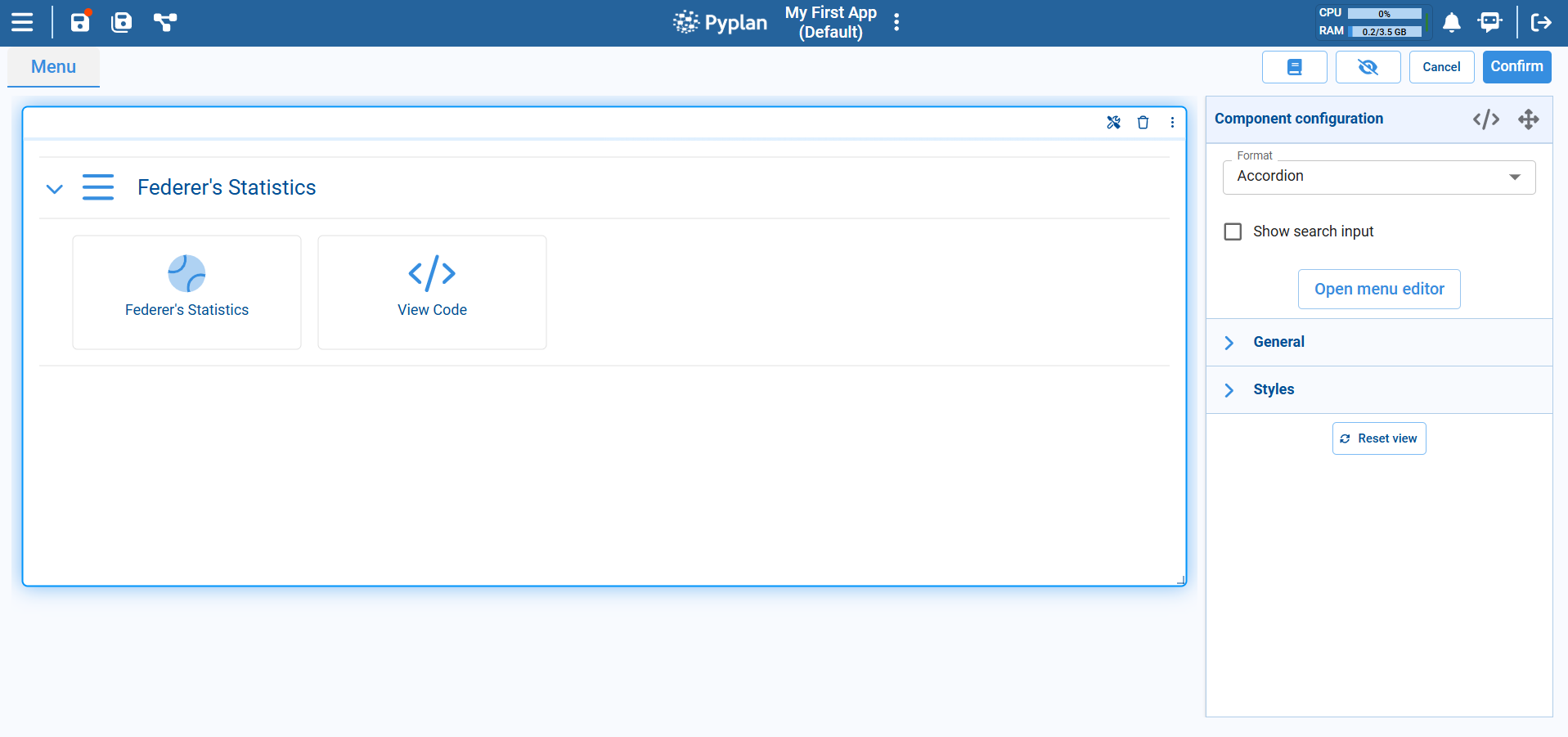
After placing a Menu component on the canvas, configure it from the Component configuration panel on the right.
Format
At the top of the configuration you choose the Format of the menu. The dropdown offers several layouts:
- Accordion: Groups items into expandable sections. Each section can contain one or more actions or links.
- Boxes: Displays menu entries as separate tiles or cards.
- Compact menu: Shows a more condensed list, useful when you have many items and less space.
The selected format affects only the visual presentation; the underlying menu structure and actions remain the same.
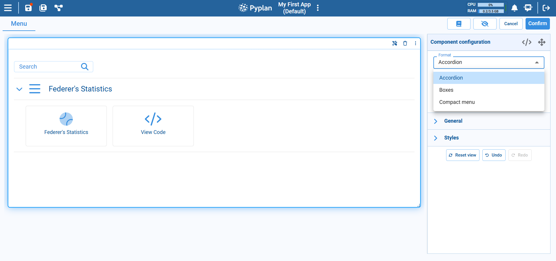
Search Input
For large menus, you can enable Show search input. This adds a search box at the top of the Menu component so users can quickly filter entries by typing part of the menu item name.
Menu Editor
To define the content and structure of the menu, click Open menu editor in the configuration panel.
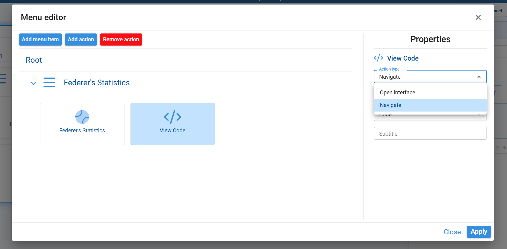
From the menu editor you can:
Top buttons:
- Add menu item: Creates a new section or group under the Root.
- Add action: Adds a new clickable item inside the selected section.
- Remove action: Deletes the selected action or item.
Left side — menu tree: Shows the hierarchical structure of sections and actions.
Right side — Properties panel: For the selected item, you can configure:
- The item name.
- Action type dropdown, where you choose what the item does when clicked:
- Open interface: Opens a specific interface in the application.
- Navigate: Navigates to another area of the app (for example, Code, Interfaces, Scenarios, etc.).
- Additional fields such as the target interface or section, and optional descriptive subtitle text.
After configuring the properties, click Apply to save the menu changes and close the editor, or Close to exit without applying modifications.
General and Styles
- Under General you configure basic options for the component, such as its title and behavior.
- Under Styles you control the visual appearance — font, colors, alignment, spacing, and related layout options — so that the component matches the overall design of the interface.
Typical Usage
The Menu component is commonly used to:
- Create a home page for an application, with grouped links to the main interfaces.
- Organize thematic sections (e.g., "Planning", "Reports", "Admin") each containing several entries.
- Offer a compact navigation bar inside a complex interface, so users can jump to the views they need without leaving the current app.